
Show conditional Twitter intents with Eleventy
Encourage users to retweet or share a post based on whether a Tweet already exists for your blog post.
, updated by  Sia Karamalegos
Learn the fundamentals behind responsive images and how to set them up in Eleventy using Cloudinary and Eleventy shortcodes

Responsive images can be challenging to set up, from writing markup to generating the images. We can make this job much easier by using Cloudinary and Eleventy. Cloudinary can host and transform our images, making generation of many file formats and sizes a matter of adding a param to a URL. Eleventy is a hot JavaScript-based static site generator. It requires no client-side JavaScript, making it performant by default.
Originally, I did not set up Cloudinary on my Eleventy blog because I had a handful of images. I would create srcsets and formats using ImageMagick and cwebp. But then, I got excited about using structured data for SEO. The image generation job got a LOT more complicated with more sizes and cropping.
In this post, first I'll go over how to serve responsive, performant images. Then, I'll show you how I implemented Cloudinary image hosting in Eleventy using Eleventy shortcodes.
<img> tag? #Let's take a look at a "fully-loaded" image tag in HTML:
  <img src="pug_life.jpg"
    srcset="pug_life_600.jpg 600w, pug_life_300.jpg 300w,"
    sizes="(min-width: 760px) 600px, 300px"
    alt="Pug wearing a striped shirt"
    width="600"
    height="400"
    loading="lazy"
  >
Why did I include all those attributes? Let's take a look at each...
src - the image to display (required!)srcset - for modern browsers, a set of candidate images and their widths in pixelssizes - for modern browsers, how wide the image will be displayed at various screen widthsalt - description of the imagewidth - the image widthheight - the image heightloading - whether to lazy-load images and iframes (check for support with caniuse)srcset and sizes so the browser can pick the best image #srcset and sizes give modern browsers a set of images and instructions for how wide they will be displayed. The browser will make the best decision on which image to load based on the user's screen width and device pixel ratio (DPR). For example, those nice Retina screens (DPR of 2) need images twice as wide as the slot we're putting them in if we want them to look good. Stated another way, if your CSS says to display an image at 100px wide, we need to supply an image that is 200px wide.
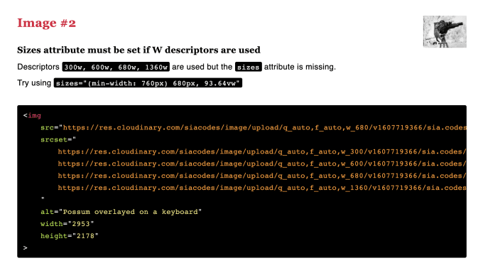
The sizes attribute can be tricky to write by hand. My favorite way (a.k.a, the lazy way) is to first give the image a srcset, then run the page through RespImageLint. RespImageLint is a nifty bookmarklet that analyzes the images on a webpage. It will tell you how far off your images are in their size, and will also give suggestions for the sizes attribute:
To prevent layout shift once the image loads, we need to provide the browser with an aspect ratio. Currently, the way to do that is to set a height and width on the image in HTML. Use the original image's dimensions since the actual size doesn't matter. The aspect ratio is what is important. Your CSS will control the actual height and width.
To prevent weird stretching, set an auto height in your CSS:
img {
  max-width: 100%;
  height: auto;
}
Jen Simmons recorded a great short video on this trick.
We now have partial support for lazy loading images and iframes! If you set the loading attribute to lazy, the browser will use the IntersectionObserver to detect if a user scrolls near the image or iframe and only load it at that time.
At the time of writing, 78% of my blog's visitors use browsers that support native lazy loading. Thus, I'm implementing it now. Import your Google Analytics data into caniuse to see how many of your visitors have support for any given web feature.
Note that you should not lazy-load images that are in the viewport on initial load ("above the fold"). This can lower your performance scores.
What are Eleventy shortcodes? Shortcodes are like filters in that they allow us to reuse code. Nunjucks, Liquid, and Handlebars templates all support both shortcodes and filters. For simplicity, the rest of this post will use Nunjucks.
<!-- FILTER using Nunjucks -->
<!-- The filter, or function, is makeUppercase, and the first and only parameter is name. -->
<h1>{{ name | makeUppercase }}</h1>

<!-- SHORTCODE using Nunjucks -->
<!-- The shortcode is user, and the parameters are firstName and lastName. -->
{% user firstName, lastName %}
For this use case, we could use either. I chose shortcodes since most of the other solutions use them, and I wanted to try them out for the first time.
Now that you know how I make images responsive, I can explain the rationale behind my solution.
The existing solutions used shortcodes that provided the full image tag based on the filename, alt, and a few other attributes. I wanted the ability to also provide all the attributes previously mentioned (loading, sizes, etc.) plus others like class.
The shortcode became unwieldy with this many parameters. Then I realized that the HTML itself was only marginally longer. Why not use HTML? The onerous part of writing the markup is setting the image urls and generating the srcsets.
Why not use HTML?
Hence, I created shortcodes that do only that - generate the src and srcset. Everything else can be set as needed in the HTML:
  <img src="{% src 'possum_film_director.jpg' %}"
    srcset="{% srcset 'possum_film_director.jpg' %}"
    sizes="{% defaultSizes %}"
    alt="Possum directing a movie"
    width="2953"
    height="2178"
    loading="lazy"
    class="super-great-style-class"
  >
I don't need a <picture> tag. Cloudinary can serve the best image format based on the user's browser through the f_auto transformation. This is one of the primary reasons I use Cloudinary. It makes my markup so much simpler.
srcset and src attributes #I gave the shortcodes smart default widths based on the styles for my site, but I allow an optional parameter to set them when I invoke the shortcode. The first step is to set our constants:
// _11ty/shortcodes.js

// Set constants for the Cloudinary URL and fallback widths for images when not supplied by the shorcode params
const CLOUDNAME = "[your Cloudinary cloud name]"
const FOLDER = "[optional asset folder in Cloudinary]"
const BASE_URL = `https://res.cloudinary.com/${CLOUDNAME}/image/upload/`;
const FALLBACK_WIDTHS = [ 300, 600, 680, 1360 ];
const FALLBACK_WIDTH = 680;

// ...
Then, we can define the shortcodes to create a src and reuse that function to create a srcset. These use the given widths or our fallback widths from the constants previously set:
// _11ty/shortcodes.js
// ...

// Generate srcset attribute using the fallback widths or a supplied array of widths
function getSrcset(file, widths) {
  const widthSet = widths ? widths : FALLBACK_WIDTHS
  return widthSet.map(width => {
    return `${getSrc(file, width)} ${width}w`;
  }).join(", ")
}

// Generate the src attribute using the fallback width or a width supplied
// by the shortcode params
function getSrc(file, width) {
  return `${BASE_URL}q_auto,f_auto,w_${width ? width : FALLBACK_WIDTH}/${FOLDER}${file}`
}

// ...
The final step in our shortcodes file is to export the two shortcodes to access them in our Eleventy config:
// _11ty/shortcodes.js
// ...

// Export the two shortcodes to be able to access them in our Eleventy config
module.exports = {
  srcset: (file, widths) => getSrcset(file, widths),
  src: (file, width) => getSrc(file, width),
}
Now we can add the shortcodes to our Eleventy config:
// .eleventy.js
const { srcset, src } = require("./_11ty/shortcodes");

eleventyConfig.addShortcode('src', src);
eleventyConfig.addShortcode('srcset', srcset);
Voilà!
Eleventy shortcodes help us make the onerous process of generating source sets for our images easier. We can use the flexibility of HTML to customize all the other behavior we want (e.g., lazy loading, classes, etc.).
Check out the full demo on CodeSandbox.
How do you use Eleventy with Cloudinary? I haven't turned this into a plugin yet. Should I? Ping me on Twitter with your thoughts!
More resources:
Cover image from Wikimedia Commons
I make websites faster, smarter, and easier to grow.
If you want someone who’s creative and precise, deeply reliable, and not afraid to tell you what’s what to get you to the next level—I’m your partner.
Encourage users to retweet or share a post based on whether a Tweet already exists for your blog post.

Add Webmentions to your Eleventy static site with this step-by-step tutorial.

Use lite-youtube-embed in Eleventy for faster and more privacy-minded video
If you liked this article and think others should read it, please share it.
 70
70
 11
11
 7
7
 Will, Old Garbage Robot, The Bourbon Bishop
Ooooooooh. source
 🐶 National Champions ✦ Eliot Sanford ✧ Hail State
Thank you, Sia. Knew you would be the perf expert with the gold. 🧙♀️ 🙌🙏🥇 M-V-P! source
 Sia Karamalegos
I mostly use it to generate all my images in the most optimal formats on my blog, but I also use it to generate these nifty social share images :) sia.codes/posts/eleventy… source
 Bob Monsour
@sia @raymondcamden That's a great post. I tweaked the eleventy image shortcode to add the loading attribute, but I see there's a lot I can still learn about how best to use sizes and use CSS properly to prevent stretching. source
 Helen Chong :prami_pride:
Special thanks to @sia for her tutorial for using Cloudinary to optimize images in Eleventy: https://sia.codes/posts/eleventy-and-cloudinary-images/ Optimize Images in Eleventy Using Cloudinary | sia.codes source
 Sia Karamalegos
Oh nice - glad it was helpful! source
 Chi Señires
Okay, I tested something in my local env, and... I guess it works? :)) I followed the instructions from @sia's article: https://sia.codes/posts/eleventy-and-cloudinary-images/ Now I just have to figure out the actual metadata images. ???? And I'm guessing if I want the rest of my images to be hoste... source
These are webmentions via the IndieWeb and webmention.io. Mention this post from your site: